Wednesday, 12 December 2012
Emote - Editing
When it came to editing the footage... it was Munnis role, but as a group we were there in case she needed any advice etc. It's always good to ask for someones opinion throughout the process, because it's easier to fix things straight away.
Emote - Filming
Because the deadline wasn't far away. We had to speed up the paste and move onto filming as soon as possible. We spent 2 days filming the footage. Again to make sure that we have a range to choose from we shot many different situations etc.
I must say I'm not the best actress out there, so if I was to change anything, I would change the actor! It was really hard to keep a straight face, and to pull the facial expressions required. I tried my best and we'll have to see how it'll look after edited.
I must say I'm not the best actress out there, so if I was to change anything, I would change the actor! It was really hard to keep a straight face, and to pull the facial expressions required. I tried my best and we'll have to see how it'll look after edited.
Emote - storyboards
After researching videos similar to ours with the rest of my group. We talked about the script etc. I then wrote it down and started thinking about my storyboards. I read through the notes I've taken during the last brief where I have read about lots of other artists research and I then started doodling. I must say that at first I drew up lots of ideas, but it wasn't continuous. I drew them separately so then when i present it to the group and they'd think the sequence should be changed I could do it easily.
In the end this is what I got.


At this point, all we had to do is to film our footage.
In the end this is what I got.
At this point, all we had to do is to film our footage.
Brief 2 - Emote
This brief requires us to work in groups of 3, where we pick a theme and create a 2 minute video
This brief required us to shoot a 2 minute sequence based on one of the themes:
LOVE
FIGHT
HAPPINESS
CHASE
GUILT
WORRY
I am working with Munni and Sophie.
We didn't want to separate and each do our own thing so we tried to stay together all the time to talk through ideas and processes to make sure everyone's happy with what we're producing.
We've started with choosing the theme, we had a brainstorm and came up with lots of ideas for each of the themes, we then narrowed it down to our top 5, and thought of all the things that could go wrong with it, and choose the idea that had less risks and problems that could happen.
After choosing the theme:
Worry
We have chosen the our roles. I have been picked to do the storyboards and acting, Sophie is to film the videos and Munni is to Edit it.
Instruct - Final Video
My Final Video!
This is my final video.
It was the first time where I actually did any video and edited it, so I must say I'm really proud of it. I did have a few problems on the way... for example where I exported the video for the first time it played back really pixelated. Turned out it's because my camera recorded it at 30fps where it should have been 25fps. So I then changed the frames per second to 25 and then exported it, which fixed the problem.
Overall it was a nice experience, and I will definitely try it again.
Instruct - Music
I spent ages trying to find the music that would fit the video. I mostly looked through instrumental songs and classical music. I didn't want it to just sound good, i wanted it to be there for a reason. And then I remembered that Vivaldi actually composed Four Seasons. I then began to look for winter.
Vivaldi - Four Seasons ( Winter)
I thought it'll fit perfectly for when my video speeds up to show the process. I thought it'll make it really exciting and dynamic. That's how I knew it is perfect.
Vivaldi - Four Seasons ( Winter)
I thought it'll fit perfectly for when my video speeds up to show the process. I thought it'll make it really exciting and dynamic. That's how I knew it is perfect.
Instruct - Filming
So the only things I had left to do was to film the video and edit it.
I filmed it all in one day. Because I not only had to film it but also be in the video. I had to use some help... So i actually had someone who kept looking at the camera to see if I'm still in the right place. I must say it would've been impossible to do completely on my own. I shot a range of videos to make sure that if something goes wrong I will have plenty more to choose from, to fix it. And so the editing started.
I edited the footage in Final Cut Pro. I must say that at first it was really confusing. But as soon as I learned what each option did, it went quite smooth.
Instruct - My storyboards
Here I have the storyboards I came up with.
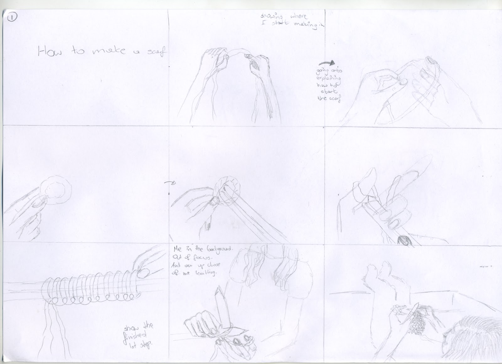
 I didn't really need a script here because it wasn't a complicated story. So I just thought about the things that need to be done and drew it up!
Instruct - Research (storyboard)
I wanted some tips and tricks on how to make the storyboards. And so I started reading about what other artists do and how they do it,on their blogs etc. I also read a few forums where other students and people that just want to storyboard professionally were talking about how they do it. Mostly it's just start of with soft pencil lines and go over them with a sharper line, then scan it and go over it in Photoshop to clean it up. Depending on the style of the artist, and what they find easier. Some prefer starting with silhouettes and then go from there. Some like to not only sketch it in pencil, but also colour it and make it a perfect illustration.
They all talk about reading and reading the script though. To think through what you're going to draw before you start.
Heres just a few of the links I've used.
http://storyboardsecrets.com/blog/storyboard-drawing-tutorial-line-of-action/
http://karenjlloyd.com/blog/
http://theartcenter.blogspot.co.uk/2010/02/rad-sechrist-storyboarding-basics.html
http://www.claytowne.com/beats-digging-ditches/storyboard-tutorial-how-to-create-storyboards-for-film-video-and-television/
Tuesday, 11 December 2012
Instruct - Research (time)
When thinking of showing time passing by I thought of a candle burning out, there being a clock in the shot etc etc.
Clock Time lapse
This is a video of a clock time lapse I like it because the person that made it used lots of different camera angles, and a lot of shaking etc. to make it really dramatic. And it worked! It looks really good, but I'm not sure if something like this would make sense to be in my video. I think it wouldn't look right.
Second Video
This is a candle burning our time lapse I found. The first thing I noticed is that it's really long and it's not as effective, if I was to use a candle burning out I'd have to use one of the thin, but really long candles, so you could literally see it go down. But again, I wouldn't be able to speed it up too much, and having just a minute for my whole video, I might not have space to fit something like this in.
Third Video
This is another time lapse video I found and at this point I actually realized that I don't need to look far to find how to represent passing by. I remembered that in movies etc. when they want to show the day passing by, they have a person in a room, with a camera in one place, and the person in several different positions and doing several different things. Either laying on the bed, sitting on the chair, then going onto laying on the floor etc. So I thought of just videoing myself knitting the scarf, in several different positions, and speeding that up. I think that would work effectively. So this is what I'm going to go with.
Instruct - Research
At this point all I had left to do was to look at other knitting videos out there.
First video
When I watched this video I found it not as interesting because it's just a basic, over the head, shot looking down at the hands. The shot does not change the angle at all throughout the video at all which makes me think this way. The other thing I've noticed is that there isn't any music in the background. Having just the person talking really puts people off, having even just a quiet simple song in the background can really change a lot. So what I've learned from this is to use a little more different angles, it's not only going to show better the technique I'll be using because you'll be able to see it from the different angles, but also make it less boring to watch.
Second Video
This video also uses just one angle of the camera. What's different here is that the person instead of talking, actually used music in the background and to explain the moves, actually used text at the bottom of the screen. In my opinion they are really distracting, because instead of looking at the person showing how to do it, you read what's below and I think in this case you'd be able to understand and repeat it just by looking at it. So I think it's unnecessary to talk or even write what to do.
Third video
I came across this video and first impression is, that it looks very professional. Probably because of the quality of the image, and the variety of clear, well thought through shots. Also the all the animations probably helped to make this impression. It has good appropriate sound effects. The talking has been recorded properly so you can hear it loud and clear. Also it must have been scripted because there aren't those moments where people forget their line and don't say anything for a while. It just shows that it's worth thinking the video through before you actually do it. Gives you a way better outcome.
Fourth Video
This is another home video. This girl actually uses different angles and you can see how much difference it makes, in being able to understand how to do it. This is definitely the way to go. I looked at the time and it took her over 4 minutes to present nowhere near as much as I wanted to, so from here on I start to understand that in my video I will have to not only speed up the footage but also in some way represent time passing by. In my mind I want my video to show the scarf knitting from start to finish, and to do it in 1 minute. Seems like a challenge.
Sunday, 9 December 2012
Instruct - Brainstorm
The first step of any project I do, is always a brainstorm. Because I'm more of a humorous person, my video ideas were mostly funny like: "How not to dance" where I'd have a dance off against my very skilled friend or "How not to bake a cake". But with that sort of ideas I wasn't sure if I'm going to be able to push the INSTRUCTIONAL part of the video, I'm scared that I might get lost in trying to make it as funny as I can possibly make it, and loose the most important part of it.
This thought made me step away from the humour and do an actual instructional video like: "How to make pancakes" or "How to make a Christmas decoration" etc. etc. But when I thought of it, I didn't want to make it easy for myself with something simple like that, and so I decided to do a video about "How To make a scarf".
Studio Brief 1 - Instruct
Our new brief is to create a 1 minute instructional video. We are free to pick what it's going to be about, it can be as funny or as serious as we want. The only rule is that it must be no longer than one minute long, end credits etc. do not count into the 1 minute.
Things we have to consider are, the sound, the light, the camera angles, and obviously how we're going to manage all those things on our own. But then again the things that make it easy are a built in mic's and tripods, the only thing you can't be sure of, is if the angle is right on the camera. So if you can, it would be best if it's not you in the video. If it has to be you, you can have some person supervising it, making sure you're in the right place.
We then have to put the video together, consider the way it's going to skip from one shot to another etc. Also we need to pick the music wisely, to not only go with the film but enhance the viewing experience, it can either be dynamic, or calming or funny etc.
The first thing I'm going to do is come up with several ideas for the 1 minute video, and pick the best one out of them all.
Monday, 5 November 2012


Inspiration
When thinking of my character I try to look for inspiration for it everywhere. This time I actually found it whilst watching a documentary. It was about the rainforest and I thought, why not create a rainforest protector, after all this is what it needs. So at this point I actually researched poisonous plants that you find in the rainforest because i thought this is a way of plants fighting for survival and it fits in perfectly. Some kill you instantly, some damage you if you touch a certain part of it, some make you go blind, there is many many ways in which they do damage which gives my character a range of possible ways attack and defend itself. Also it sets a beautiful environment for my character to be in. That's why I decided to go with this idea. So I started sketching and this is what I ended up with:
It's a mixture of the plants that I looked at; strychnine tree, stinging tree, cowhage, curare, caladium, bead vine, castor bean etc. Not necessary in looks, but also in what they can do
It's a mixture of the plants that I looked at; strychnine tree, stinging tree, cowhage, curare, caladium, bead vine, castor bean etc. Not necessary in looks, but also in what they can do
Animation - research
Lifted - a short Pixar animation directed by Gary Rydstrom
I came across many many of Pixar's short animations, usually you see them before movies etc and to be honest, it's impossible not to love them! This one I can actually associate myself with because I have yet to pass my "driving test" which is technically it but a ufo version. So this makes it really funny because I know that this is what the test is going to look like, stressful to me, very stressful... yet if someone was there looking at me they'd find me and my actions amusing. Obviously because it's a very professional animation there is not a single bad word i can say about the way it looks, because it's perfect!
I came across many many of Pixar's short animations, usually you see them before movies etc and to be honest, it's impossible not to love them! This one I can actually associate myself with because I have yet to pass my "driving test" which is technically it but a ufo version. So this makes it really funny because I know that this is what the test is going to look like, stressful to me, very stressful... yet if someone was there looking at me they'd find me and my actions amusing. Obviously because it's a very professional animation there is not a single bad word i can say about the way it looks, because it's perfect!
Animation - research
Flipbook animation - lgviewty on youtube
This is an animation I came across while looking at flipbook animations which is what I'm about to do. The first thing I notice is the length of that animation it's over a minute, then I realise how many pages he must've drawn to make this. I do see it's paid off because the animation came out really well, mostly because of the quality of the drawings, it's really neat... maybe even too neat, I suppose what he might've done is do it digitally and print it out. Other than that I love the way hes drawn the explosions, movement etc. I think it looks very realistic.
This is an animation I came across while looking at flipbook animations which is what I'm about to do. The first thing I notice is the length of that animation it's over a minute, then I realise how many pages he must've drawn to make this. I do see it's paid off because the animation came out really well, mostly because of the quality of the drawings, it's really neat... maybe even too neat, I suppose what he might've done is do it digitally and print it out. Other than that I love the way hes drawn the explosions, movement etc. I think it looks very realistic.
Animation - research
A brief History Of Pretty Much Everything - James Francis Bell
This is another flipbook animation I came across. Amazingly long, over 3 minutes! When you read the description he says that it's roughly about 2100 pages long and took about 50 jotter books! He says it's his final piece for his AS art course and took him about 3 weeks to finish. It's a very simple animation not much detail in it I could compare it to a children's drawings but I think that's the point of it, it's the design of it and if it was a very good quality drawings it wouldn't have the same messy feel to it.
This is another flipbook animation I came across. Amazingly long, over 3 minutes! When you read the description he says that it's roughly about 2100 pages long and took about 50 jotter books! He says it's his final piece for his AS art course and took him about 3 weeks to finish. It's a very simple animation not much detail in it I could compare it to a children's drawings but I think that's the point of it, it's the design of it and if it was a very good quality drawings it wouldn't have the same messy feel to it.
Animation - research
Kiwi By Dony Permedi
This is another one of my favourite animations, done by a student. Compared to other ones this isn't looking as professional as them yet, it's amazing. I believe it's because of what is actually going on, here we go back to - it's not only what it looks like, it's also what it means, there are a lot of emotions going through it, it's happy, funny, sad etc. and all that makes it a brilliant piece.
This is another one of my favourite animations, done by a student. Compared to other ones this isn't looking as professional as them yet, it's amazing. I believe it's because of what is actually going on, here we go back to - it's not only what it looks like, it's also what it means, there are a lot of emotions going through it, it's happy, funny, sad etc. and all that makes it a brilliant piece.
Animation - research
Octopus cartoon
This is one of my favourite animations of all time. I love it because it's got so many emotions running through it, it's funny, cute, it's got those "unsure if they're gonna make it" moments etc. I suppose overall it's just not boring! I love how you can read all the emotions through their face expressions and it's not only brief things, you can almost feel what they feel. The animation is so intense once you start watching it you cannot just stop and walk away you have to finish watching it and see what happens! It just shows that not only a good quality image is what matters, it's also a storyline.
This is one of my favourite animations of all time. I love it because it's got so many emotions running through it, it's funny, cute, it's got those "unsure if they're gonna make it" moments etc. I suppose overall it's just not boring! I love how you can read all the emotions through their face expressions and it's not only brief things, you can almost feel what they feel. The animation is so intense once you start watching it you cannot just stop and walk away you have to finish watching it and see what happens! It just shows that not only a good quality image is what matters, it's also a storyline.
Character Design - research


The first character reminds me of a mixture of rock and lava. The size of it and the fire within makes it look like a very dangerous thing simply because it doesn't look like a thing that could get damaged easily. The lava to me looks like human human blood, the placement of it looks like that is what's running through his veins. From the look of it you can imagine the temperature of it, you look at it and immediately know you don't want to be near it. The artist exaggerated the size of his arms, legs and his hands to show his strength.
The second character also seems to be made out of rock and lava. This artist on the other hand presented his strengths in a different way. He used many spikes all over his body which immediately make you think of danger and his power must be some sort of fireball throw because both of his hands are on fire.
I put those two together just to see what difference little things make and how, in different ways you can present similar things.
Character design - research

The first thing I notice and I have to talk about are the horns, they're massive and it makes them seem very dangerous. Their colour makes me think they're like metal, solid and unbreakable and if used well can deal a great amount of damage. When I look at the rest of the character I don't think they're there for attack, it looks to me like they're used for self defence more than anything else.
The other thing I must comment on is the detail that goes into this piece. I can see all those different brush strokes on the fur and you can see how much work it required... and to be honest it paid off because it delivered such an amazing piece.
Character Design- research

This is a piece by Lucas Graciano. At first it looks pretty simple, it's an animal... but when you look closer you'll notice little branches and bark instead of skin and fur. It's those little things that change a usual looking thing into something exciting! The things that make this creature really scary is the size of the claws, sharp teeth (which are on show, just like when animals are trying to scare someone off) and the horns. The colours used on the character are dark, which create a great contrast for the teeth which draws your eyes to them.
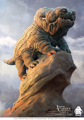
Character Design - research
I was recently looking at the work of Michael Kutche, a German artist whos work we can see in things like "Thor" and "Alice In Wonderland". I looked at quite a few and i've noticed that he doesnt stick to one style, the looks of his work vary from really detailed 3D looking creatures to soft brush characters.
 On this image we see a Woola concept, it's a lizard-like dog. When you read the description, the "lizard like dog" it sounds wrong because dogs are usually associated with these friendly looking fluffy animals but when you try and imagine a lizard, it doesn't put such a nice image in your head. But i must say that Michael did make it look really friendly, simply because he made it really fat and wrinkly which makes it look like a really lazy, barely moving thing... Also with it having a really friendly looking, smiling face, it's hard to look at it and not smile back! He used very soft colours to again to make it look more friendly. On it's back we can see some sort of spikes, but it'a not scary or intimidating when I look at it I think that maybe this is it's kind of fur.
Character Design - research
When looking for inspiration for my own character I looked at all forms of characters already out there. Starting with humans through animals all the way to abstract characters.
 This is one of the first images I found. I like it because of the mystery within; the character's body is invisible, which makes it this way. It's the jagged edges on the armor and the shapes of the helmet which gives it a scary, aggressive and dangerous features. It's usually the characteristics you give an enemy. I think another great thing about this piece is that it's a human character, yet they made it look really interesting by making just the armor speak for it, just like face expressions speak. I suppose the bad thing about it would be that it can only express one feeling and it's anger. Dark colours used within also help to enhance the scary look.

Illustrator Induction
We've had an illustrator induction where we got taught how to use the software. The teacher presented us with many techniques to create things in illustrator as well as many many handy tips like; it's best to create your animations in illustrator
because it's easier to edit the shapes without (like in Photoshop)
having to start from scratch over and over again. We then had to either use the character we've designed or quickly sketch something up to work with. I decided to create something simple to work with just to make it easier for myself since I wasn't familiar with illustrator. So i made a quick sketch in my sketchbook and scanned it in to work with.
 This is what I created in the end! It's just a little cactus, I know it's not realistic looking or even a little 3D but I'm still not that amazing with using illustrator.I created him using mostly the pen tool and basic shapes, then filled him with some colours. I must say at first it was pretty hard to do it, but once I understood how it works it became quite easy.

Photoshop Induction
This is a photoshop Induction session we've recently had.
During that session we got showed a lot of ways in which to use Photoshop and at the end we had to create a collage out of the photographs we've taken during our trips to the museums. I must blame the quality of my end pieces on the light which we didn't have during the day, it was raining so there was barely any light coming through the windows, and in the museums not only it was pretty dark but also we weren't allowed to use the flash. Everything seemed to come out blurry and so I tried to pick the things that weren't as bad as the rest. This is what I came up with.


One of the images is a character, it's actually a very creepy doll I used that and to make her more creepy i put a dagger in one of her hands and a poison in the other. The poison flask was actually a gun powder flask so I made it a bit smaller to fit in her hand. I enhanced the colours on her so she isn't as pale as she was. Also I've increased the contrast to create more shadows etc. just so it looks less different from each other.
The other image is actually a castle image, not taken by me, I got it off the web just because I couldn't work with the blurry images. Instead of creating two characters I thought I'd create the environment for the creepy doll. I've increased contrasts again and made the castle a lot darker. Then i simply took an image of the sky and made that nearly black to enhance the horrifying look.
In the end we had to save both images in 2 ways, one as 72dpi, RGB suitable for screen view, and another as 300dpi, CMYK suitable for print.
Monday, 1 October 2012
Hello and Welcome to my Blog!
As you probably know by now, I am Kinga. I am a current student at Leeds College of Art, studying Digital Film, Games and Animation... reason for deciding to study such a course is because I love games, and someday I would like to be a part of making one.
Subscribe to:
Comments (Atom)